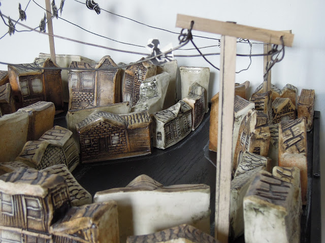
i finally finished up the section of sprawl to go to mudfire studios in atlanta for an upcoming show. the piece is 42 houses arranged into cul-de-sacs on a 24"x24" panel. this smaller version of sprawl was a struggle to make. the hundreds of houses all grouped and stacked together look, well, sprawling, but even packed full with houses the panel looked small and undefined. pointless. so i marked the footprint of each house on the panel to make it easier to re-assemble, then taped off where the road portion of the cul-de-sac would be and sprayed a white outline for the curb. i re-assembled all the houses back on the panel. and this is the original image that i submitted for the show. however, the work still didn't have the aesthetic that i was seeking. it still needed upgrades. i started thinking about how i could make a fence around the houses that wouldn't obstruct the view of the houses around the outside of the panel. instead of making a fence i decided that power lines could also play that role. so i cut and assembled 4 poles and strung wire between them. still it was lacking. naturally, the power lines needed birds. so, i added some 2 sided block-printed paper birds that i glued to the wires. i was surprised at the effect of power lines acting as a 'ceiling' frame around the work. it gave the work a sense of space by defining where the sky begins.
the show at mudfire is multiple clay interpretations of 'home' and 'house' and what those words mean. this was my definition. this, of course, is one of those wonderful bits of finite math that comes with a matrix of answers. some people will make a house, some will make what's going on inside the house, some will deconstruct it, some will reconstruct it, some will fantasize it, some will realize it. all will be different. mine is less about those words and more about the mass production of living in the suburbs. the repetition of the block printed houses allows me to repeat forms easily, like there are model homes you can choose from and slight variations in the construction to make it your own. it isn't weird to see housing editions pop up in a summer in the suburbs. it is common, you barely notice the missing fields. what is interesting to me is how quickly they go up. and how shitty they are built. yards of hydro-seeded mud, black plastic mail boxes, and cheap tiny trees. the insides are no different, with plastic mouldings, and prefab particle board everything. this is what "from the 150s" gets you. as a kid, when my own 'old' neighborhood grew a new cul-de-sac edition, it was like the neighborhood got commercial plastic wash-over. there was no character in many of those houses. they felt 'modeled' and homogenized and had an bit of blank distance when i ran through the neighborhoods. i imagined they all watched the same tvs, drove the same black/grey/beige car/van/suv, and worked in the same blank office building. there is a loss in the wildness of living a manufactured life with every resource at your beckon call. in this sense my piece is a reflection of the domestication of humanity.


2 comments:
This is so cool. Really nice!
thanks dana...and thanks for reading :)...we've been following you through newfoundland...post more it's fun to read and see!!!
Post a Comment